This site is optimized for desktop. Some charts and tables may not display properly on mobile devices.
Advanced Real-Time Chart
📈 Real-Time Price Charts
The chart is powered by Tradingview and provides real-time market data (depending on the exchange) with dynamic, interactive charts. You can switch between different timeframes (1 minute, 5 minutes, 1 hour, 1 day, etc.) and zoom in or out to analyze short-term or long-term trends.
Technical Analysis - Does it really work?
We've tested the above mentioned and dozens of other indicators over the years, and most prove unreliable for predicting trend continuations or genuine market turns. In our view, they offer a limited ability to signal trend reversals.
All technical indicators and oscillators generate two primary types of trading signals:
Overbought and Oversold Levels
The MFI fluctuates between 0 and 100, providing a measure of buying and selling pressure. Traditionally, levels above 80 are considered overbought, suggesting the asset may be overvalued and due for a potential pullback or reversal. Conversely, levels below 20 are considered oversold, indicating the asset may be undervalued and poised for a potential bounce. It's crucial to remember that in a strong trend, the MFI can remain in overbought or oversold territory for extended periods, so these signals are most effective in ranging or choppy markets.Divergence
This is often a more powerful signal than overbought/oversold readings. A bearish divergence occurs when the price makes a higher high, but the MFI forms a lower high. This indicates that buying pressure is waning even as the price rises, signaling a potential trend reversal to the downside. Conversely, a bullish divergence occurs when the price makes a lower low, but the MFI forms a higher low. This suggests that selling pressure is decreasing despite the falling price, hinting at a potential upward reversal. Divergences can provide early warnings of a shift in market momentum.
📊 Switch Between Chart Types
Choose how you view the market — from classic candlesticks showing price action and momentum, to line, bar, or area charts for a cleaner view. Each chart type offers a different perspective to help you spot trends, reversals, and key price levels with ease.
💱 Choose Your Currency
View stock prices in the currency that matters to you. Instantly switch between USD, CAD, EUR, and more — making it easy to compare global assets or track performance in your preferred currency.
⚙️ Add Technical Indicators
Use the “Indicators” button at the top of the chart to add built-in tools like: Moving Averages (MA, EMA, SMA), RSI (Relative Strength Index), MACD, Bollinger Bands, …and hundreds more. You can even combine multiple indicators.
Technical Indicators in Action... or Should We Say "Inaction"?
Every trader knows the classic lineup: the Moving Average Convergence Divergence (MACD) flashing a crossover signal, the Relative Strength Index (RSI) dipping into oversold territory, and Bollinger Bands® squeezing tight, hinting at a potential breakout. These tools are the bedrock of technical analysis for a reason—they are fantastic at visually summarizing past price action and momentum. We use them to identify trends, spot potential reversals, and provide a structured framework for interpreting market noise. In a clear, trending market, they can feel like a crystal ball, giving traders the confidence to enter and exit positions.
However, this confidence is often a mirage. The most significant limitation of these famous indicators is that they are inherently lagging. They are mathematical derivatives of past prices, meaning by the time your MACD line crosses or your RSI signals an overbought condition, a significant portion of the move has often already occurred. This lag can lead to entering a trend just as it's exhausting itself or getting whipped around in a sideways market as signals conflict and reverse. They tell you what happened, but rarely the why, leaving you vulnerable to false breakouts and sudden reversals that pure price data cannot foresee. Relying solely on them is like driving while only looking in the rearview mirror; you'll see where you've been, but you'll be completely unprepared for the sharp turn ahead.
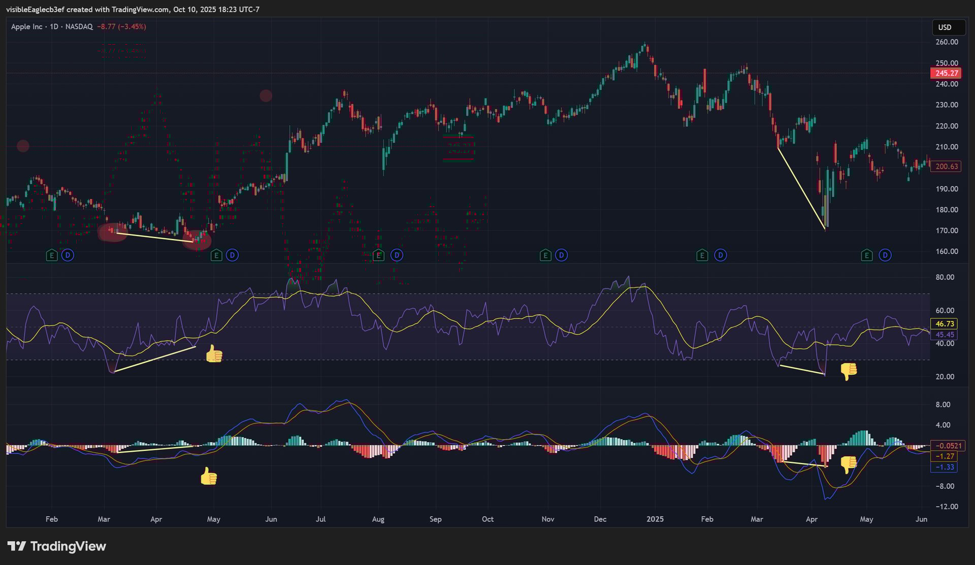
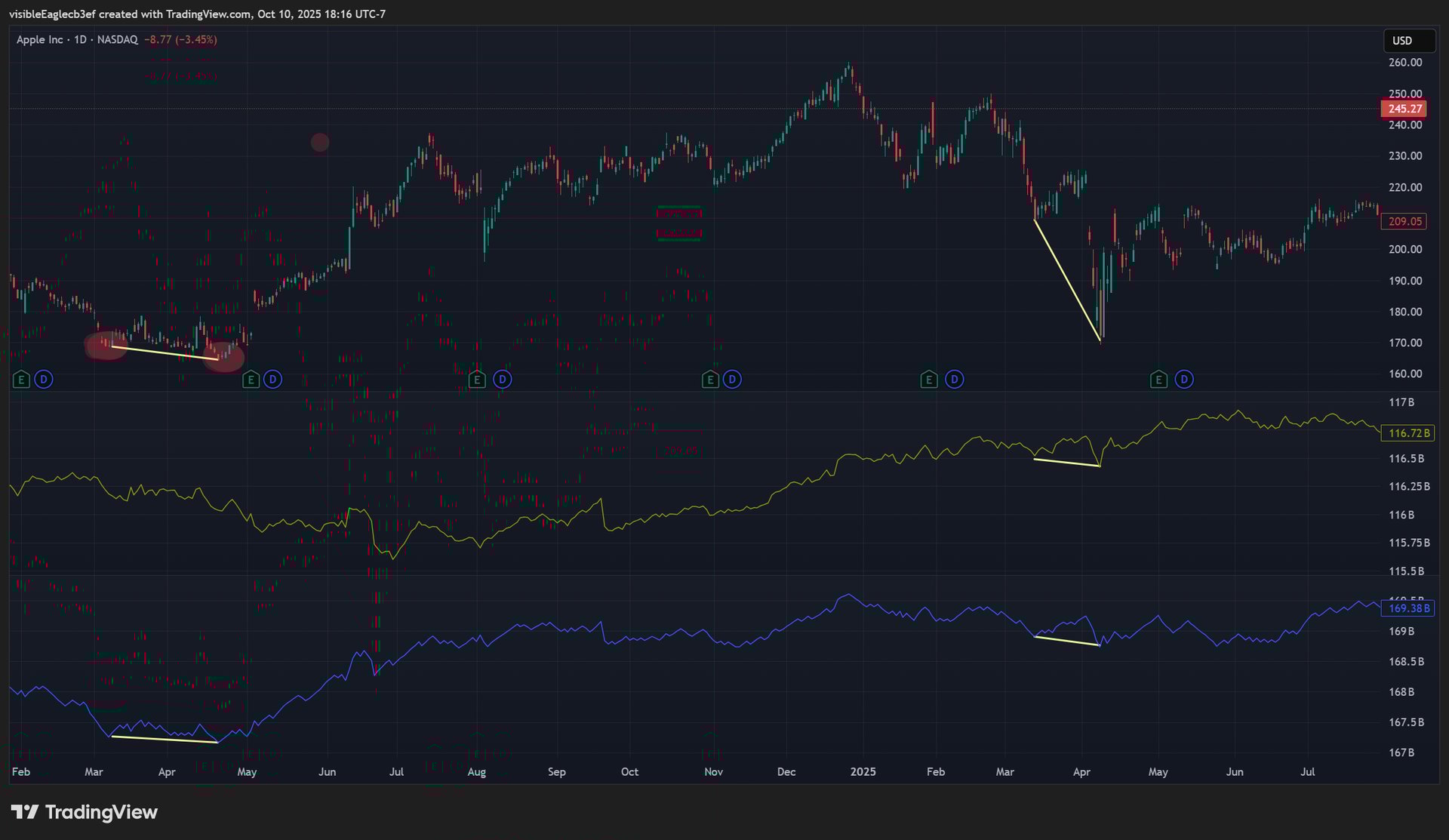
Let's examine real-world examples of RSI and MACD divergence from an Apple's stock chart. In May, 2024, the price had made a lower low. However, both indicators simultaneously formed a higher low. This established a clear bullish divergence, foreshadowing a powerful rally that propelled the price upward.
In 2025 Apr both indicators failed to form a divergence and didn't signal the follwoing proce uptrend.
The reliability of the divergence signal is significantly enhanced when it aligns with the broader trend.
It is also essential to remember that no indicator offers an absolute guarantee. Technical analysis deals in probabilities, not certainties. Therefore, to build greater confidence in any signal, it is wise to wait for price action confirmation—such as a break above a key resistance level—before considering a trade. This practice helps filter out false signals and aligns your strategy with the actual momentum of the market.
RSI and MACD Divergence
Overbought and Oversold Levels
Now, let's examine a real-world example of RSI overbought and oversold signals. In March 2024, the RSI for a specific stock entered the oversold area, theoretically signaling a buy. However, the price continued to drop until it formed a bullish divergence, which finally marked the true bottom. In a later instance in April 2024, the RSI dropped again into oversold territory below 20, and this time it successfully forecasted a price rally.
This inconsistency fuels the ongoing debate among traders about whether the standard 30/70 levels or stricter 20/80 levels should define overbought and oversold conditions. The plot thickens when, in June-July 2024, the RSI hit above 80—the overbought level—yet the price kept climbing. This serves as a critical reminder that overbought signals alone are not infallible, just as a security can remain oversold during a strong downtrend.
Ultimately, the reliability of any RSI signal is significantly enhanced when it aligns with the broader trend. The June 2024 episode is a clear illustration that in a powerful uptrend, overbought can simply mean "strong," and acting against the trend based on a single indicator is a high-risk strategy.
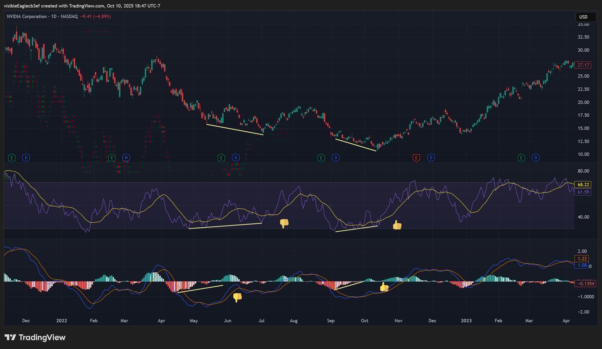
Let's examine the real-world performance of MACD and RSI divergences in two major tech stocks, NVIDIA (NVDA) and AMD. On the NVDA chart, we see a telling contrast between two periods. In May 2022, both the MACD and RSI developed clear bullish divergences—where prices made a lower low, but the indicators formed a higher low. This classic signal incorrectly forecasted a reversal, as the stock continued its steep decline in the face of broader macroeconomic pressures. Just a few months later, however, in October 2022, a nearly identical setup of bullish divergences in both indicators successfully marked the true bottom, preceding a massive multi-year rally. A similar story played out with AMD. In June 2023, a promising bullish divergence failed, giving way to further correction. Yet, by September 2023, a new divergence pattern accurately foreshadowed a significant upward trend.
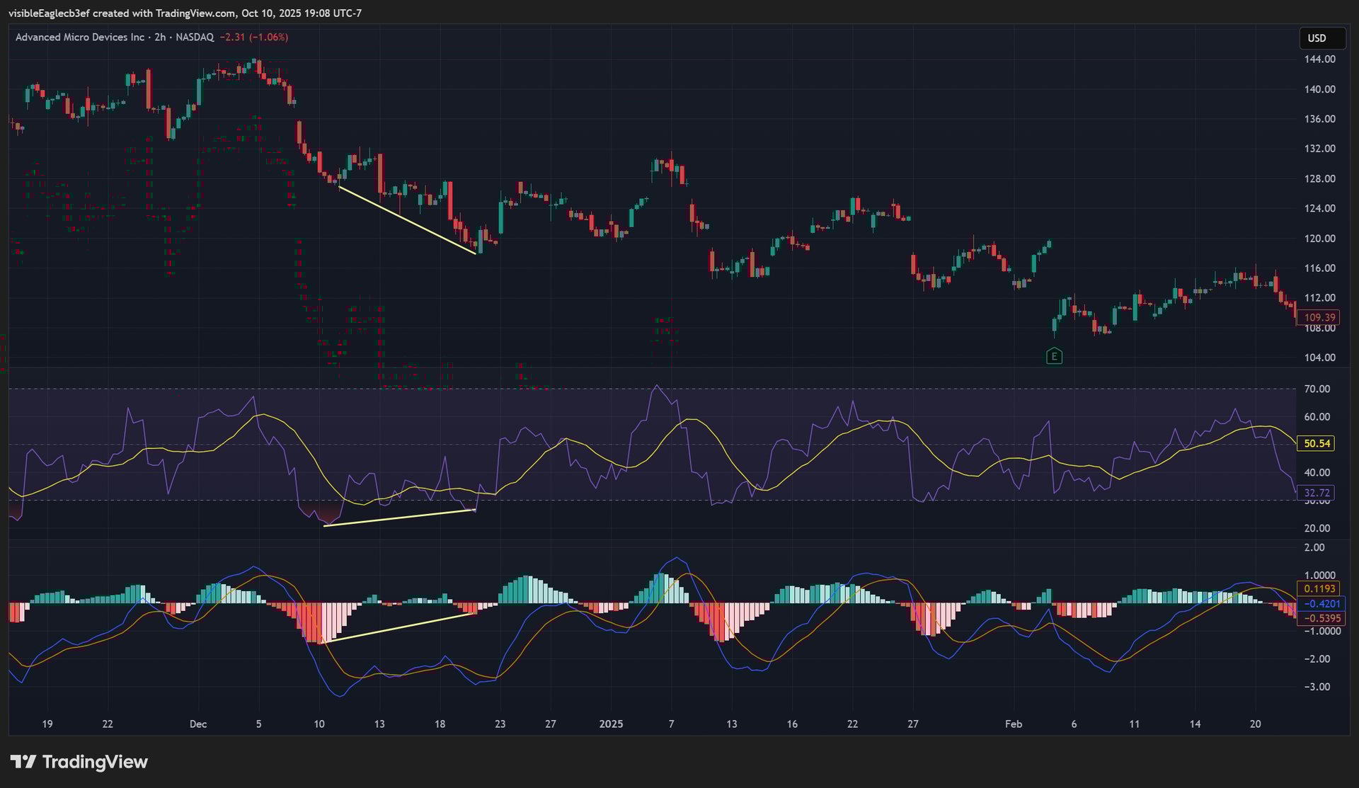
In the case of AMD, we examine the indicator performance on a two-hour chart. A bearish MACD and RSI divergence was formed in December 2023. Again, a complete failure.
These back-to-back examples from the same stocks highlight a critical lesson: divergences signal a slowing of momentum, but they cannot predict the underlying fundamental or market-wide forces that will ultimately determine if that slowdown becomes a true reversal or just a pause in the prevailing trend.
But what about indicators designed to lead, rather than lag? Let's consider two popular examples: On-Balance Volume (OBV) and the Commodity Channel Index (CCI).
On-Balance Volume (OBV) is hailed as a leading indicator because it uses volume flow to predict price changes. The theory is sound: volume precedes price. If OBV is rising, it suggests smart money is accumulating, and a price rise should follow. Conversely, falling OBV suggests distribution. In a perfect scenario, a bullish OBV divergence—where price makes a new low but OBV does not—can be a powerful signal of an impending reversal. Yet, OBV is notoriously noisy. It can flash false accumulation signals in choppy markets, and its calculation can be distorted by a single high-volume day that may not represent a sustained trend. While it adds a valuable dimension, OBV alone cannot distinguish between "smart money" and a random, high-volume spike caused by a news event.
Similarly, the Commodity Channel Index (CCI) is used to identify overbought and oversold levels, as well as new trends. Its strength lies in measuring the current price level relative to an average, which helps spot cycles and extremes. A move above +100 might suggest strong upward momentum, while a drop below -100 could indicate aggressive selling. However, CCI is a momentum oscillator, and in a strong, sustained trend, it can remain in "overbought" or "oversold" territory for extended periods, leading to premature exits from profitable trades. Its signals are most reliable within ranging markets, but its effectiveness breaks down precisely when you need it most: during the powerful, trend-driven moves that generate the most significant profits.
The common thread is context. No single indicator—whether lagging like the MACD or purportedly leading like OBV and CCI—provides a complete picture. They are specialized tools, not trading systems. Their signals are probabilistic, not prophetic, and their success hinges on being filtered through a broader understanding of market structure, fundamental catalysts, and overarching sentiment. This is the complex, multi-dimensional analysis that separates the professional from the amateur, and it's exactly the gap that a deeper, AI-augmented due diligence process is designed to fill.
This response is AI-generated, for reference only.
Powerful Asset Filtering & Discovery
Scroll down to explore a stock screener powered by the same live data that feeds our proprietary API. While this tool isn't powered by AI unlike our API and is manual, it puts the power of discovery in your hands. Effortlessly filter thousands of global assets using a comprehensive set of institutional-grade criteria to pinpoint the exact opportunities that match your unique strategy.
Filter by Core Metadata
Symbol Type: ETFs, Forex Pairs, Cryptocurrencies, Indices, or Futures.
Exchange: e.g., NASDAQ, NYSE, TSX, LSE, BINANCE).
Country: US, Canada, etc.
Sector & Industry: Drill down into specific market segments, such as Technology, Healthcare or Energy


Filter by Fundamental Data
Valuation Metrics: Screen by P/E Ratio, P/B Ratio, EPS, and Market Capitalization.
Growth & Profitability
Liquidity and Financial Stabilty
Dividend Information
Price Performance: Top Gainers or YTD performance, etc.
Momentum: Use indicators like RSI to find oversold (<30) or overbought (>70) conditions, or look for bullish/bearish crossovers with the MACD.
Volatility: Find assets breaking out of consolidation or trading near volatility bands using tools like Bollinger Bands.
Filter by Technical Analysis Indicators


Stock Screener
Stock Heatmap
Explore a comprehensive overview of global stocks, segmented by sector. To analyze a specific segment, just click its filter name (e.g., "Electronic Technology").
Crypto Coins Heatmap
Get a bird's-eye view of the crypto market, organized by coin type. Click on any asset to analyze it further. You'll be directed to TradingView for detailed charts and in-depth data.
ETF Heatmap
This tool provides a comprehensive view of exchange-traded funds, categorized by type (e.g., equity, bond, or sector). To analyze a specific segment, just click its filter name (e.g., "Equity").
Stock Market
See the top five gaining, losing, and most active stocks for the day. It updates based on current market activity – so you'll always see the most relevant stocks.
Market Overview
Built for when you need to take a macro look at the markets.
Get in Touch with Us
We'd love to hear from you about our newsletter.

